
Green Navigation Bar: Build a Modern Website Menu
27
Sep 2026
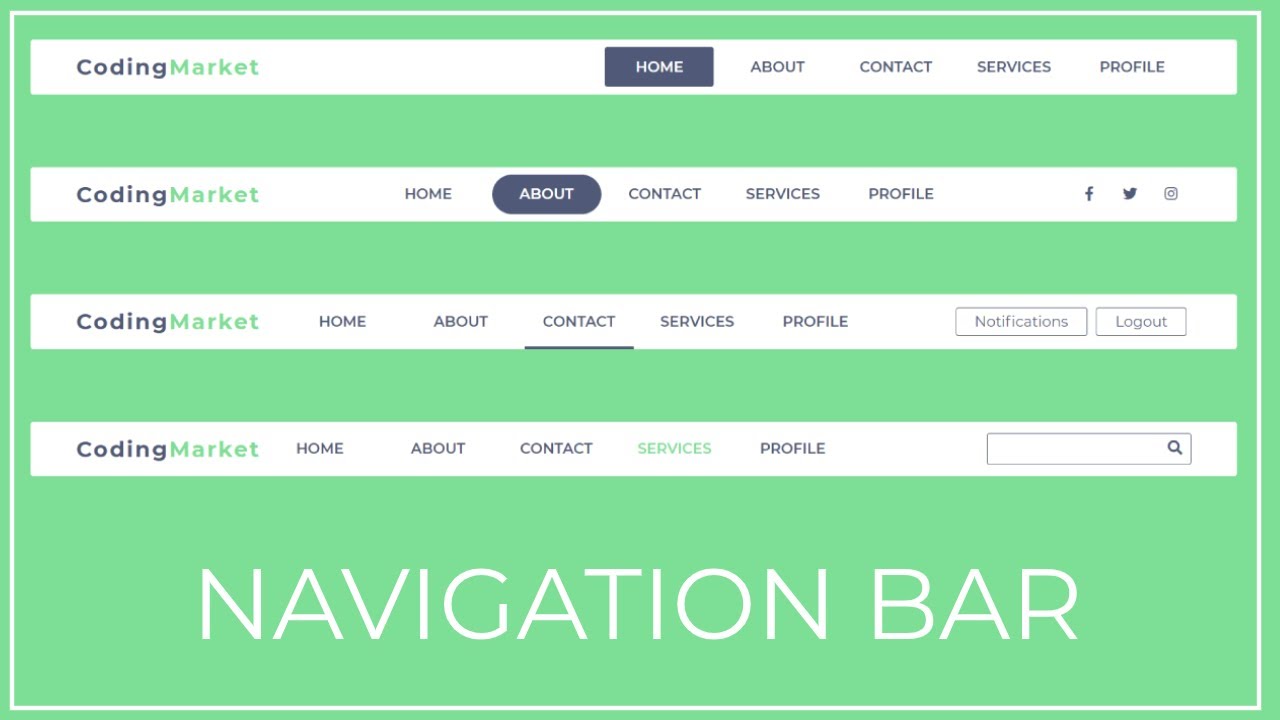
A green navigation bar can give a website a fresh, natural, and distinctive visual identity while keeping important pages easy to find. Whether you are designing a business website, landing page, portfolio, blog, or e-commerce store, the navigation bar is one of the first interface elements visitors use.
A well-designed green navigation should do more than simply look attractive. It needs clear links, readable text, appropriate spacing, responsive behavior, and an intuitive structure. Developers may also need features such as a nav bar dropdown, mobile navigation, or a navbar toggler icon.
This guide explains how to plan and build a green navigation bar, how navigation bar CSS works, and which design practices can make the finished menu easier to use.
What Is a Green Navigation Bar?
A green navigation bar is a website header or menu that uses green as its primary background, accent, border, or visual theme. It normally contains links to important pages such as Home, About, Services, Blog, Contact, or Products.
Green can work particularly well when a brand wants a visual association with nature, growth, freshness, technology, finance, health, or sustainability. However, the exact shade should be selected according to the site's overall branding rather than simply choosing the brightest available green.
A navigation bar typically includes:
- Brand logo or website name
- Primary navigation links
- Dropdown menus
- Search or utility links
- Call-to-action buttons
- Mobile menu controls
The goal is to make navigation immediately understandable without overwhelming the visitor.
Why Use a Green Navigation Design?
Color is an important part of interface design, but the navigation structure matters more than the color itself. A green header can become effective when it supports the site's existing visual identity.
Strong Brand Recognition
A consistent color used across the header, buttons, icons, and other interface elements can help create a recognizable design system.
Clear Visual Separation
A contrasting green header can visually separate the navigation from the main page content. This can help visitors identify where the site's primary menu begins and ends.
Flexible Styling
Green comes in many shades, from muted sage and olive to darker forest tones and brighter modern greens. This makes it possible to create very different visual styles while keeping the same basic navigation structure.
Choosing the Right Green
There is no single correct green for every website. The appropriate shade depends on the brand, surrounding colors, typography, and contrast requirements.
For example:
- Dark green: Works well for professional and corporate interfaces.
- Forest green: Can create a strong, traditional appearance.
- Sage green: Fits softer and minimalist designs.
- Emerald green: Can provide a modern and premium visual style.
- Bright green: Creates stronger visual energy but needs careful contrast management.
Before selecting a color, check how white, black, and other navigation text colors appear against the background.
Building a Green Navigation Bar With CSS
The appearance of a navigation menu is normally controlled through HTML and navigation bar CSS. HTML provides the structure, while CSS controls colors, spacing, typography, positioning, hover effects, and responsive behavior.
A basic structure might include a header containing a navigation element, followed by a list of links.
For example, a simple navigation structure can contain:
- Logo
- Navigation list
- Individual links
- Dropdown container
- Mobile menu button
CSS can then define the green background, link color, padding, alignment, and hover state.
A basic styling approach could use properties such as:
nav {
background: #176b3a;
}
nav a {
color: #fff;
text-decoration: none;
padding: 15px 20px;
}
nav a:hover {
background: #12542e;
}
The exact colors should be adapted to the site's branding and accessibility requirements.
Green Navigation Bar Layout
A useful navigation layout should establish a clear visual hierarchy.
A common desktop arrangement is:
Logo → Main Navigation → Optional CTA
For example:
Logo | Home | About | Services | Blog | Contact | Get Started
This arrangement keeps primary navigation predictable and gives users a clear path through the website.
Avoid adding every available page to the main menu. Secondary pages can often be grouped inside a dropdown or moved into the footer.
Adding a Nav Bar Dropdown
A nav bar dropdown is useful when a website contains several related pages under one category.
For example:
Services
- SEO
- Web Design
- Content Marketing
- Social Media
- PPC
Instead of displaying all five options in the main navigation, they can be grouped under one Services menu.
A good dropdown should:
- Open predictably
- Have readable links
- Provide enough spacing
- Avoid covering important content unnecessarily
- Work with keyboard navigation
- Remain usable on smaller screens
Dropdowns should also have clear labels. A visitor should understand what is inside the menu before opening it.
Creating a Responsive Green Nav
A navigation bar that looks good on a desktop can become difficult to use on a phone if the same layout is simply compressed.
Responsive navigation adapts the interface to the available screen width.
On smaller screens, a common pattern is:
Logo + navbar toggler icon
When the user activates the menu button, the navigation links become visible.
The navbar toggler icon is often represented by three horizontal lines, although other accessible menu controls can be used.
A responsive menu should provide enough space for users to tap links comfortably. Small text and tightly packed navigation items can make mobile browsing frustrating.
Bootstrap and the BS Navbar
Developers working with Bootstrap may use the bs navbar component instead of creating every navigation behavior from scratch.
Bootstrap provides established classes and patterns for:
- Responsive navigation
- Collapsing menus
- Dropdowns
- Branding
- Mobile navigation
- Alignment
- Utility controls
A Bootstrap-based green navigation can be customized with CSS rather than relying entirely on the framework's default appearance.
For example, a site might retain Bootstrap's responsive behavior while applying its own green background, typography, spacing, and hover states.
This can reduce development time while still allowing the navigation to match the website's branding.
Green Nav vs. Other Navigation Styles
The phrase green nav can refer to anything from a completely green header to a navigation system that uses green only for active links or hover states.
These approaches create different visual results.
Style
Main Use
Visual Effect
Full green background
Main site header
Strong and recognizable
Green links
Minimal navigation
Subtle
Green hover state
Interactive feedback
Clear interaction
Green active tab
Current-page indicator
Strong orientation
Green CTA button
Conversion-focused design
Draws attention
The best choice depends on the site's overall interface.
Navigation Bar Accessibility
A visually attractive navigation menu is not enough. Visitors should also be able to understand and operate it.
Consider these accessibility principles:
Use Sufficient Color Contrast
Text must remain easy to read against the green background. A very bright green with white text, for example, may create weaker contrast than expected.
Use Clear Link Labels
Labels such as “Services,” “Pricing,” and “Contact” are generally easier to understand than vague labels.
Support Keyboard Navigation
Users should be able to navigate interactive menu elements using a keyboard.
Make Interactive Elements Obvious
Hover and focus states should clearly indicate which navigation item is currently being interacted with.
Avoid Color-Only Indicators
Do not rely exclusively on green versus another color to communicate important navigation states. A visual indicator, underline, weight change, or other cue can provide additional context.
Common Green Navigation Mistakes
Even a simple navigation bar can create usability problems when it is poorly structured.
Too Many Menu Items
Trying to place every website page in the header makes navigation harder to scan.
Poor Contrast
A green background with insufficient text contrast can reduce readability.
Inconsistent Styling
If every page uses a different header design, users may struggle to understand the site's navigation system.
Overuse of Dropdowns
A menu containing multiple nested dropdown levels can become difficult to use, particularly on mobile devices.
Ignoring Mobile Users
A desktop-only navigation can create serious usability issues on smartphones.
Weak Active States
Users should be able to tell which section or page they are currently viewing.
How to Improve a Green Navigation Bar
If you already have a navigation menu, improvements do not necessarily require a complete redesign.
Start with these steps:
- Review the menu structure. Remove unnecessary top-level items.
- Check the color contrast. Make sure links are readable.
- Improve spacing. Give each link enough room to scan and interact with.
- Add clear hover and focus states. Make interactions obvious.
- Test dropdowns. Ensure menus open and close reliably.
- Check mobile behavior. Test different screen widths.
- Review keyboard navigation. Make sure interactive controls can be accessed without a mouse.
- Keep branding consistent. Match the navigation with the rest of the site's design.
- Test real user paths. Check whether visitors can quickly find important pages.
These changes can improve both appearance and usability without adding unnecessary complexity.
Green Navigation for Different Website Types
A green navigation system can be adapted to different industries.
Business Websites
A professional dark-green header can support a clean corporate design.
Health Websites
Softer green shades may fit a calm visual interface, provided they maintain adequate contrast.
E-Commerce Websites
A green navigation can be combined with clear product categories and a prominent shopping or account area.
Environmental Websites
Green may naturally fit environmental branding, although the design should still avoid relying on color alone to communicate meaning.
Blogs
A simple green header with clear category navigation can keep the interface lightweight and easy to scan.
How to Make a Green Navigation Bar More User-Friendly
Good navigation is ultimately about reducing friction.
Visitors should not have to think about where a link might be located. The main menu should reflect the site's information architecture.
For example, if users frequently need to find pricing information, putting Pricing in an obvious location may be more useful than hiding it several levels deep.
Likewise, a business that receives many inquiries may want Contact to remain visible instead of placing it inside a secondary dropdown.
The design should follow user priorities rather than simply adding visual decoration.
Final Thoughts on the Green Navigation Bar
A green navigation bar can create a distinctive and professional website header when its color, structure, typography, and responsive behavior work together. The most successful navigation designs are not necessarily the most complicated. They make important pages easy to find and provide clear feedback when users interact with the menu.
Whether you build the interface with custom navigation bar CSS, a Bootstrap bs navbar, or another framework, focus first on usability. Choose an appropriate green, maintain strong contrast, organize links logically, and make the navigation work well on both desktop and mobile devices.
A well-planned green navigation, sometimes simply called a green nav, should support the visitor's journey rather than compete with the content. When the structure is clear and the interactions are predictable, the navigation becomes a useful part of the overall website experience.
6. FAQs
What is a green navigation bar?
A green navigation bar is a website menu that uses green as its primary background, accent, border, or visual theme. It can contain links, dropdowns, branding, and responsive mobile controls.
How do I create a green navigation bar with CSS?
You can create one by styling the navigation container with a green background and defining link colors, padding, spacing, hover states, and responsive behavior with CSS.
What is a navbar toggler icon?
A navbar toggler icon is a mobile navigation control that allows users to open or close a collapsed menu. It is commonly represented by a three-line menu icon.
What is a nav bar dropdown?
A nav bar dropdown groups related navigation links under a single menu item. It is useful when a website has several pages belonging to the same category.
Can Bootstrap be used to create a green navigation?
Yes. A Bootstrap navbar can provide responsive navigation behavior, while custom CSS can be used to change its colors, spacing, typography, and other visual elements.
What color works best with a green navigation?
There is no universal best green. The choice should match the brand and maintain sufficient contrast between navigation text and the background.
Should a green navigation bar be used on mobile?
It can be, provided the navigation is responsive. On smaller screens, a collapsed menu with a clear toggler can make the header easier to use.

Comments
No comments yet.