
Green Navbar Design for Modern Websites
12
Sep 2026
A green navbar can give a website a fresh, professional appearance while making its main pages easier to navigate. But choosing a green background is only the beginning. A useful navigation bar needs readable text, clear spacing, responsive behavior, logical dropdowns, and an obvious path to important pages.
For developers and designers working with Bootstrap or custom HTML and CSS, there are many ways to build navigation. You may need a simple navbar black, blue navbar, or white navbar, depending on the site's branding. You may also want icons, a search field, a login button, dropdown menus, or a mobile toggle. This guide explains how to approach each element without sacrificing usability.
What Is a Green Navbar?
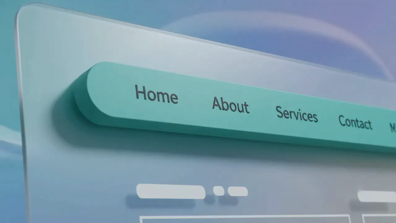
A green navbar is a website navigation bar that uses green as its primary background or accent color. It normally contains a logo, navigation links, dropdowns, buttons, and sometimes search or account controls.
Green works particularly well for websites associated with technology, sustainability, finance, education, health, outdoor products, and modern business brands. The exact shade matters, however. A darker green can create a formal appearance, while a brighter green can feel more energetic.
The most important considerations are:
- Text contrast
- Navigation hierarchy
- Mobile responsiveness
- Button visibility
- Dropdown usability
- Brand consistency
- Page-loading performance
Choosing the Right Navbar Color
The navbar color should support the site's visual identity rather than compete with the content. When selecting a navbar background, consider the logo, page background, typography, buttons, and overall brand palette.
Popular options include:
- Green navbar: Fresh, natural, modern
- Black navbar: Strong, minimal, professional
- Blue navbar: Trustworthy and corporate
- White navbar: Clean and lightweight
- Orange navbar: Energetic and attention-grabbing
A color navbar should also maintain enough contrast between links and the background. A light green background usually needs dark text, while a deep green background can work well with white text.
Think about the complete set of navbar colors, rather than selecting only one color. Hover states, active links, dropdown backgrounds, borders, and buttons should all work together.
Building a Responsive Navigation Bar
A desktop navigation menu can display several links horizontally, but mobile screens do not have enough space for the same layout. This is why a collapsible navbar is essential for responsive websites.
A responsive navigation system normally contains:
- A logo or brand name
- Primary navigation links
- A mobile menu button
- Optional dropdowns
- Optional search and account controls
In Bootstrap, the navbar toggleable pattern allows navigation links to collapse at smaller screen sizes. The navbar toggler icon gives mobile users a clear way to open the menu.
A good collapsible navigation bar should open and close smoothly without covering essential page content or creating confusing navigation states.
Green Navbar With Bootstrap
Bootstrap makes it relatively straightforward to create responsive navigation. A navbar icon Bootstrap implementation can combine the framework's responsive navigation classes with icons from an appropriate icon library.
A typical Bootstrap structure can include:
- .navbar
- .navbar-brand
- .navbar-toggler
- .navbar-collapse
- .navbar-nav
- .nav-item
- .nav-link
- Dropdown components
The bootstrap navbar toggler icon is especially useful on mobile because it replaces a large desktop navigation menu with a compact control.
Developers can also create a navbar with icons Bootstrap layouts where small icons accompany important links. Icons should support recognition rather than replace descriptive labels when a label is necessary for clarity.
Adding Dropdown Menus
Websites with multiple categories often need dropdown navigation. A dropdown in Bootstrap navbar can organize related pages beneath one primary navigation item.
For example:
Services
- SEO
- Web Development
- Paid Advertising
- Content Marketing
This creates a cleaner navigation bar with dropdown Bootstrap structure than placing every service directly in the main menu.
A Bootstrap navbar with dropdown menu should be easy to operate with a mouse, keyboard, and touch screen. Avoid excessively deep menus. Users should not have to move through several levels just to reach an important page.
A properly structured bootstrap navigation dropdown can also make larger websites easier to understand.
Adding a Logo and Brand Area
The left side of a navigation bar commonly contains the site's nav logo. A logo immediately tells users where they are and gives them a simple route back to the homepage.
A navbar image can be used for a logo, although the image should be optimized so it does not unnecessarily slow down the page.
You may also encounter designs using a nav bar image, navbar images, or a navbar image background. These approaches can work, but they need careful testing because background images can reduce text readability.
A navbar on image layout is particularly important to test. If navigation sits directly over a hero image, the background can change underneath the text and reduce contrast.
Using Icons, Search, and Login Controls
Modern websites often include more than navigation links.
A navbar search field can help users find articles, products, services, or documentation without browsing multiple pages. Search becomes especially valuable on content-heavy websites.
A search in navbar design should remain compact and obvious. On mobile devices, it may be better to place search inside the expanded menu instead of permanently displaying a large input field.
A navbar login button can be useful for SaaS platforms, membership websites, dashboards, and ecommerce stores. Keep account actions visually distinct from ordinary navigation links.
A small navbar icon can also identify actions such as search, user accounts, notifications, or shopping carts.
Navbar Separators and Secondary Navigation
A navbar separator can visually distinguish groups of links, although excessive dividers can make a navigation bar feel cluttered.
Some websites also use a sub nav bar below the primary navigation. This works well when a major section has several related pages.
For example:
Main Navigation:
Home | Services | About | Blog | Contact
Sub Navigation:
SEO | Local SEO | Technical SEO | Content | Link Building
This approach can improve organization without forcing every page into one crowded menu.
Using a Background Image
A background image for navbar can create an attractive visual effect, particularly for editorial or creative websites. However, navigation should remain readable regardless of the image underneath it.
If you use an image as the background for navbar, test:
- Light and dark images
- Mobile cropping
- Text contrast
- Hover states
- Different screen sizes
- Page loading speed
A plain solid background is often easier to maintain. For many business websites, a simple green or white navbar provides better consistency than a complex image.
Responsive Toolbar and Mobile Navigation
A responsive toolbar should adapt to the available screen width. Desktop users may see the full navigation, while mobile users may see a hamburger-style menu.
The nav toggle should be large enough to tap comfortably. The navbar toggle icon should also have a clear visual state so users know whether the menu is open.
Bootstrap's navbar collapse functionality provides a common solution. Developers may also encounter classes or examples described as collapse navbar collapse or navbar collapse collapse when looking through different Bootstrap implementations. The exact markup should depend on the Bootstrap version being used.
The goal is simple: navigation should remain usable at every viewport size.
Designing a Navbar for SEO and UX
Navigation is not only a visual component. It can influence how users and search engines understand a website's structure.
A good navigation system should:
- Link to important pages
- Use descriptive anchor text
- Keep major sections easy to discover
- Avoid unnecessary menu items
- Provide a logical hierarchy
- Work properly on mobile
- Avoid hiding essential content behind confusing interactions
For an SEO-focused website, navigation should help visitors reach important service pages. For example, a business offering SEO can organize links around technical SEO, local SEO, content, and paid advertising.
Econix Digital's SEO strategies for law firms can serve as an example of how a content-focused website can connect informational resources with relevant services.
Similarly, navigation can make commercial services easier to discover, such as paid advertising services, local SEO services, and email marketing.
Common Green Navbar Design Mistakes
A visually attractive menu can still create usability problems.
Avoid these common mistakes:
Poor Contrast
Green text on a similar green background can become difficult to read. Check contrast before publishing.
Too Many Links
A navbar containing 15 or 20 competing links can overwhelm visitors. Move secondary pages into relevant dropdowns or a secondary navigation area.
Weak Mobile Design
Do not assume a desktop navbar will automatically work on phones. Test the expanded and collapsed states.
Oversized Logos
A large navbar image can push navigation links out of position, particularly on smaller screens.
Confusing Dropdowns
Users should understand what each dropdown contains before selecting an item.
Unclear Active States
Visitors should be able to identify their current section. A subtle background, underline, or text change can help.
Green Navbar vs Other Navbar Colors
There is no universally best navbar color. The correct choice depends on branding and the surrounding design.
Navbar Style
Best For
General Feel
Green
Nature, technology, health, modern brands
Fresh
Black
Premium, creative, corporate sites
Strong
Blue
Business and professional websites
Trustworthy
White
Minimal and clean interfaces
Simple
Orange
Promotional and energetic designs
Bold
A navbar blue or blue navbar may work better for a corporate brand, while a green design can complement a company that wants a natural or contemporary visual identity.
Best Practices for a Green Navbar
Before launching your navigation, check the following:
- Keep the most important pages visible.
- Use consistent spacing between links.
- Make the logo clickable.
- Test dropdowns on touch devices.
- Provide a clear mobile toggle.
- Check color contrast.
- Keep search easy to find when needed.
- Use descriptive link text.
- Test keyboard navigation.
- Make sure the menu works across major screen sizes.
A well-designed green navbar should feel almost invisible to the user. Visitors should know where to click without having to think about how the navigation works.
Conclusion
A green navbar can be a strong design choice when it fits the site's brand and provides enough contrast for comfortable reading. The best navigation combines a clear logo, logical links, responsive behavior, accessible dropdowns, and useful features such as search or login.
Bootstrap can simplify responsive implementation through components such as the navbar toggler, dropdowns, and collapse functionality. Custom HTML and CSS provide more control when a unique design is required.
The key is to design navigation around the user's needs first. A beautiful navbar is useful only when visitors can quickly understand it, use it on any device, and reach the information they came to find.

Comments
No comments yet.