
Avengers Logo: Meaning, Symbols, Movie Logos & History
25
Sep 2026
The Avengers logo is one of the most recognizable visual identities associated with superhero entertainment. Its circular letter “A,” arrow-like extension, and bold typography have become closely connected with Marvel's Avengers team and its films, merchandise, promotional artwork, and fan culture.
But there is more to the logo than a recognizable letter. Different Avengers projects have used variations in typography, color, texture, and presentation to match the tone of individual stories. Some designs look metallic and futuristic, while others use darker or more dramatic treatments.
This guide explains the meaning behind the Avengers emblem, the differences between major movie logo designs, the Avengers symbol, and common searches such as Avengers logo PNG, Avengers Doomsday logo, and Avengers movie logos.
What Is the Avengers Logo?
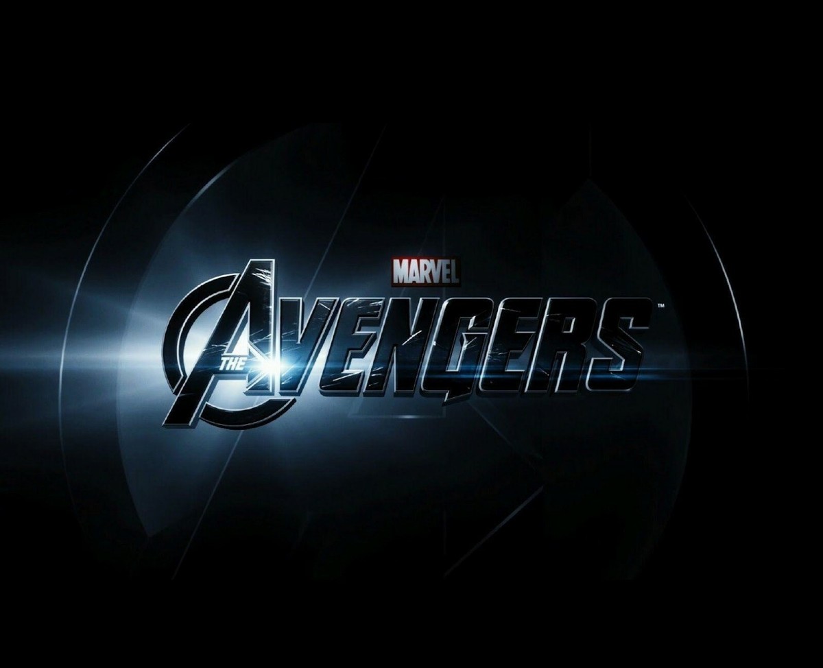
The Avengers logo is the primary visual mark associated with Marvel's fictional superhero team, the Avengers. Its most recognizable feature is a stylized capital “A” enclosed by a circular shape, often accompanied by the word AVENGERS in bold lettering.
The design works well as a superhero emblem because it is simple enough to recognize quickly while still having a strong visual presence.
The core design commonly includes:
- A large stylized “A”
- A circular or ring-like form
- Strong geometric lines
- Bold uppercase lettering
- A horizontal or arrow-like extension through the “A”
- Metallic, white, red, gold, or other treatments depending on the artwork
The basic structure has remained visually recognizable while different Avengers stories have introduced their own treatments.
What Does the Avengers Symbol Mean?
The Avengers symbol is built around the letter “A,” which naturally represents the name Avengers. The surrounding circular form helps turn the letter into an emblem rather than simply a piece of typography.
The symbol is particularly effective because it can work independently of the full wordmark.
For example, the emblem can appear on:
- Posters
- Costumes
- Shields and props
- Merchandise
- Promotional graphics
- Video game artwork
- Social media graphics
- Collectibles
A viewer familiar with the franchise can often recognize the team from the emblem alone.
Why the Circle Matters
The circular structure gives the symbol a contained, badge-like appearance. This makes it suitable for physical objects as well as digital graphics.
The design can therefore function both as a logo and as an icon.
Avengers Logo vs. Avengers Symbol
Although the terms are sometimes used interchangeably, there is a small practical difference.
Term
Typical meaning
Avengers logo
The broader visual identity, including the wordmark
Avengers symbol
The standalone emblem, particularly the stylized “A”
Avengers wordmark
The written AVENGERS lettering
Movie logo
A version created or presented for a specific film
The exact terminology can vary depending on the context, but this distinction helps explain why people searching for the Avenger logo may actually be looking for the standalone emblem.
The Evolution of Avengers Movie Logos
The Avengers visual identity has changed across different films and promotional campaigns.
The core emblem provides continuity, while movie-specific typography and effects help establish the tone of each project.
The Avengers
The original team film established a recognizable visual language for the franchise. The logo generally combines the circular “A” emblem with a strong metallic wordmark.
The overall appearance communicates a combination of technology, action, scale, and superhero identity.
Avengers: Age of Ultron
The Age of Ultron branding continued the established Avengers identity while incorporating a darker, more mechanical atmosphere associated with the film's antagonist and storyline.
The recognizable emblem remained important, but the overall presentation could be treated with darker metallic effects and a more industrial visual style.
Avengers: Infinity War
The visual identity for Infinity War leaned into a more dramatic and cinematic presentation.
The established Avengers lettering was still recognizable, but the film's promotional design emphasized the larger stakes of the story.
Avengers: Endgame
The Endgame branding became particularly distinctive because of the film's connection to the conclusion of a major storyline.
The familiar Avengers identity was combined with a darker, metallic treatment. This helped distinguish the movie's promotional materials while maintaining continuity with previous films.
These examples show why searching for Avengers movie logos can produce several visually different results rather than one universal design.
What Makes the Avengers Logo So Recognizable?
A successful logo does not always need to be complicated. The Avengers identity demonstrates how a relatively simple visual structure can become strongly associated with a larger brand.
Several characteristics contribute to its recognizability.
1. A Simple Core Shape
The stylized “A” gives the emblem an immediate connection to the Avengers name.
2. Strong Geometry
The circular form and sharp lines create a distinctive silhouette.
3. Adaptable Design
The emblem can be rendered in different colors, textures, sizes, and materials without losing its basic identity.
4. Consistent Typography
The wordmark reinforces the emblem and gives the overall identity a strong cinematic appearance.
5. Franchise Recognition
Years of films, merchandise, games, posters, and other media have reinforced the visual association.
Avengers Logo PNG: What Does It Mean?
People searching for an Avengers logo PNG are usually looking for a digital image of the logo with a transparent background.
PNG is commonly used for graphics that need transparency. For example, a designer might want to place a logo over a custom background without showing a rectangular image box around it.
A transparent PNG can be useful for:
- Graphic design projects
- Fan artwork
- Presentations
- Digital compositions
- Video thumbnails
- Personal creative projects
However, the availability and permitted use of copyrighted or trademarked artwork depends on the source and intended use. A file being available online does not automatically mean that it can be freely redistributed or used commercially.
Avengers Doomsday Logo
The Avengers Doomsday logo is associated with Avengers: Doomsday, another title in the Avengers film series.
Search interest around a new movie logo often includes questions about how its design compares with previous Avengers branding.
A movie logo can perform several jobs at once:
- Identify the film
- Connect it with the larger franchise
- Establish a visual tone
- Work across posters and promotional material
- Remain recognizable in small formats
- Create continuity with previous installments
For a franchise as visually established as Avengers, maintaining recognizable elements while introducing a new presentation can be especially important.
Because movie branding can change during development and promotion, viewers should distinguish between officially released artwork and fan-created or speculative designs circulating online.
Avengers Logo Design Elements
From a design perspective, the Avengers identity offers useful lessons.
Typography
The lettering is bold and designed to remain highly visible. Strong typography helps the logo maintain impact even when used over busy promotional imagery.
Shape
The circular emblem gives the design a compact structure. This makes it practical for both horizontal branding and standalone icon applications.
Contrast
Avengers artwork frequently uses strong contrast between the logo and its background. Metallic lettering against a dark background is one example of how contrast can increase visual impact.
Texture
Different film campaigns can use textures such as metal, stone, light, or atmospheric effects. These treatments can change the mood without completely redesigning the underlying identity.
Symbols for the Avengers and Their Visual Language
When people search for symbols for the Avengers, they may be referring to the team's central emblem or the individual visual identities connected with its members.
The Avengers are a group made up of characters with their own symbols, costumes, weapons, and visual identities. This creates a broader visual system around the main team logo.
For example, individual heroes may be recognized through:
- Character emblems
- Signature colors
- Costumes
- Weapons or equipment
- Typography
- Repeated graphic motifs
The team logo provides a common visual identity while individual character symbols maintain separate recognition.
Why the Avengers Logo Works as a Brand Mark
The design demonstrates several fundamental branding principles.
Recognition: A distinctive shape can be identified quickly.
Consistency: Repeated use across media strengthens recognition.
Flexibility: The same basic emblem can receive different visual treatments.
Scalability: A simple symbol can work on both large posters and smaller merchandise.
Association: Repeated exposure connects the mark with a specific fictional universe and team.
These principles are useful beyond entertainment branding. Designers creating logos for businesses can also consider how a mark will perform across different sizes, backgrounds, and applications.
Common Mistakes When Searching for an Avengers Logo
Search results can contain official artwork, fan creations, edited graphics, merchandise images, and unrelated logos.
A few checks can help identify what you are looking at:
- Check the source. Determine whether the image comes from an official Marvel or film-related source.
- Look at the context. A movie logo should correspond to the relevant film or promotional campaign.
- Check image quality. Low-resolution files may be screenshots or reposts.
- Distinguish fan art from official artwork. Many creative versions imitate the established style.
- Consider usage rights. A logo associated with a major entertainment franchise may be protected by intellectual-property rights.
These checks are particularly important if the image is intended for commercial design work.
Avengers Logo and Avenged Sevenfold Logo: A Common Mix-Up
The Avenged Sevenfold logo is unrelated to the Avengers superhero franchise.
Avenged Sevenfold is a music band, while Avengers is a fictional superhero team. Their names can appear close together in search queries, which can create confusion.
The distinction is simple:
- Avengers → Marvel superhero team
- Avenged Sevenfold → American heavy metal band
If you are searching for an Avengers graphic, check the spelling carefully before downloading or using an image.
Marvel Logo With Characters vs. Avengers Logo
Another common search is Marvel logo with characters. This can refer to promotional compositions that combine the Marvel brand identity with images of multiple characters.
That is different from the Avengers logo itself.
The Marvel logo represents the broader entertainment brand, while the Avengers emblem identifies a specific superhero team and its related stories.
Promotional artwork may combine both identities, which is why search results can sometimes make them appear interchangeable.
How to Use the Avengers Logo for Design Inspiration
If you are studying logo design, the Avengers identity can be useful as a case study without copying the artwork.
Focus on the design principles rather than reproducing the protected mark.
Study:
- Shape construction
- Typography
- Visual hierarchy
- Contrast
- Scalability
- Symbol development
- Brand consistency
- Adaptation across different media
For example, you could create an original superhero-team logo using a completely different letterform and visual structure. This lets you practice the same design principles while developing your own creative identity.
Conclusion
The Avengers logo is more than a stylized letter “A.” Its recognizable emblem, bold wordmark, adaptable visual treatments, and long association with Marvel's superhero team have made it an important part of the franchise's visual identity.
From classic Avengers branding to individual Avengers movie logos and newer projects such as the Avengers Doomsday logo, the basic visual language continues to provide continuity while allowing different stories to establish their own tone.
For designers, the logo also offers a useful lesson in visual identity: a strong symbol can remain recognizable while its typography, color, texture, and presentation evolve.
6. FAQs
What does the Avengers logo represent?
The Avengers logo represents Marvel's fictional superhero team. Its central stylized “A” connects directly to the team's name, while the circular structure gives it the appearance of a distinct emblem.
What is the Avengers symbol?
The Avengers symbol is generally the standalone stylized “A” emblem associated with the team. It can appear independently from the full AVENGERS wordmark.
What is an Avengers logo PNG?
An Avengers logo PNG is a PNG-format image of the Avengers logo. PNG files can support transparent backgrounds, making them useful for digital design and image compositions, subject to applicable usage rights.
Are all Avengers movie logos the same?
No. Different Avengers films can use variations in typography, texture, color, and visual presentation while retaining recognizable elements of the broader Avengers identity.
Is the Avenged Sevenfold logo related to the Avengers logo?
No. The Avenged Sevenfold logo belongs to the music band Avenged Sevenfold and is unrelated to Marvel's Avengers superhero franchise.
What is the Avengers Doomsday logo?
The Avengers Doomsday logo refers to branding associated with Avengers: Doomsday. Official promotional artwork and branding should be distinguished from fan-created or unofficial versions.
Why is the Avengers logo so recognizable?
Its simple central “A,” circular structure, bold typography, repeated use across films and merchandise, and association with the Avengers franchise all contribute to its strong visual recognition.
Can I use the Avengers logo commercially?
Commercial use can involve trademark and copyright considerations. An image being available online does not automatically grant permission for commercial use, so users should verify the applicable rights and permissions before using the logo commercially.

Comments
No comments yet.